
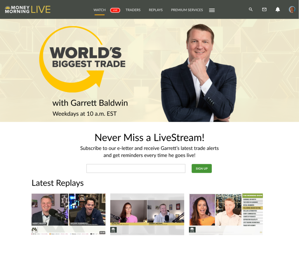
Money Morning Live
client: Money Map Press, a B2C Financial Publisher in Baltimore
role: UX Designer
timeline: 6 months
Background
In 2021, Money Map Press — a financial publishing company with over a decade in the business — launched Money Morning Live, a new M-F live trading platform. With nearly 1,000 daily viewers on the main livestream and the Rooms page driving 14% of total site traffic, the platform had real traction. But it had almost no conversion infrastructure. Users were watching, browsing, and leaving — without signing up, subscribing, or coming back. I joined shortly after launch to fix that.
Discovery
I started with a thorough usability audit using Nielsen Norman Group’s heuristics — analyzing trader personas and benchmarking against competitor platforms including Twitch, YouTube, and TastyTrade. Combined with a deep dive into Google Analytics, two critical problems emerged.
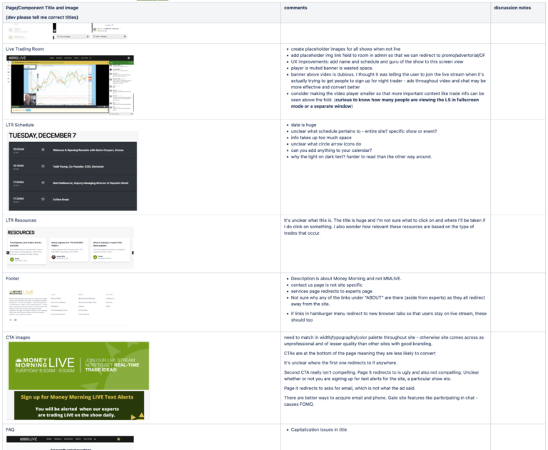
Impact/effort prioritization matrix from the usability audit
First, the navigation was inconsistent across every live room. Each page had a different logo, different links, and different menu structure — users couldn’t tell where they were or how to get back. Second, the Rooms page gave no indication of which rooms were currently live, leaving users to click through each one individually to find out.

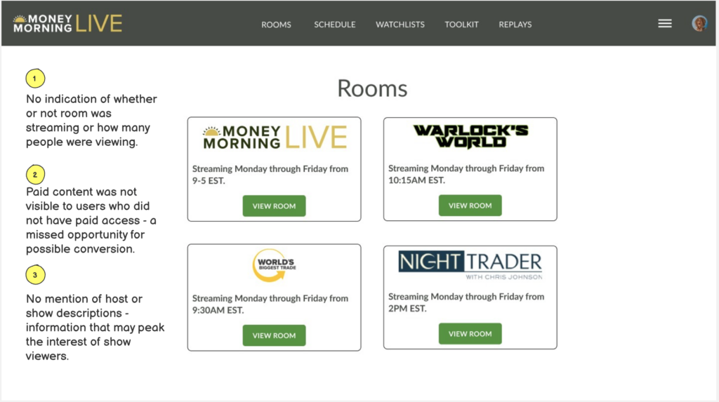
These weren’t subtle issues. On a platform built around live, time-sensitive trading content, not knowing what’s live right now is a fundamental failure of the most basic user need.
From the audit I prioritized solutions by impact and effort, developed a phased roadmap, and worked with stakeholders to convert it into sprint-ready tickets.
Definition
The audit pointed to two clear opportunities that would drive both user experience and business outcomes.
The first was navigation and discoverability — unifying the experience across all live rooms so users could orient themselves, find content, and move fluidly between shows without confusion.
The second was conversion. With nearly 1,000 daily viewers and virtually no mechanism to capture them, Money Morning Live was leaving significant subscriber growth on the table. Every unsubscribed user watching a free stream was a missed opportunity to move them deeper into Money Map Press’s marketing funnel — from free newsletter to premium subscription.
Fixing navigation was a UX problem. Fixing conversion was a business problem. The redesign had to solve both.
Design
The redesign focused on two areas: the live trading rooms themselves, and the Rooms hub page that connected them.
For the live rooms, the most impactful change was the simplest: a unified navigation menu across every room. One consistent structure replaced the patchwork of different logos, links, and menus — users could finally orient themselves and move between shows without starting over.
The bigger strategic swing required stakeholder buy-in. I presented initial wireframes proposing two distinct views of the live room — one for free users and one for paid subscribers. For free users: an email capture beneath the livestream and add-to-calendar reminders for upcoming shows. For paid subscribers: deeper content tied to their subscription, including the trader’s portfolio, reports, and video clips. I made the business case alongside the design, showing how each touchpoint moved users down the funnel. Stakeholders saw the value and allocated development resources to flesh out the full design.
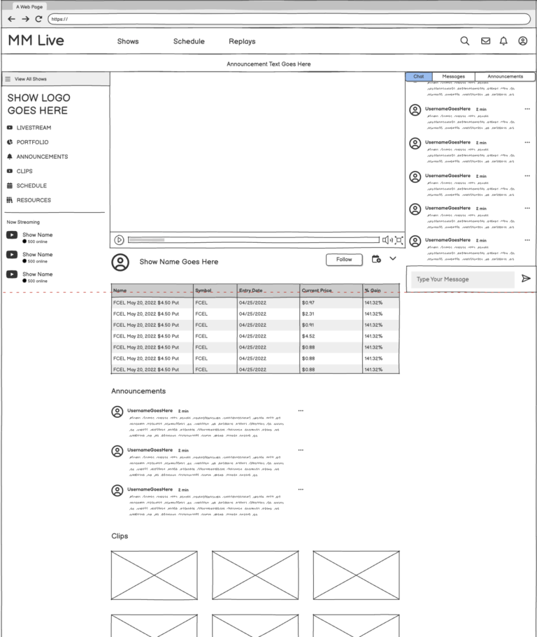
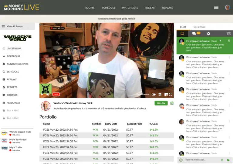
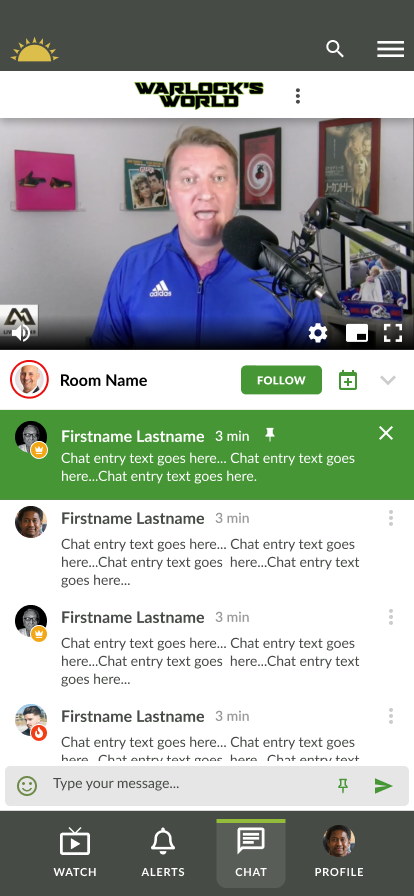
The single highest-leverage conversion decision was gating the chat. Restricting free room chat to email subscribers created a natural, low-friction incentive to sign up — and introduced a conversion touchpoint that hadn’t existed anywhere on the platform before.
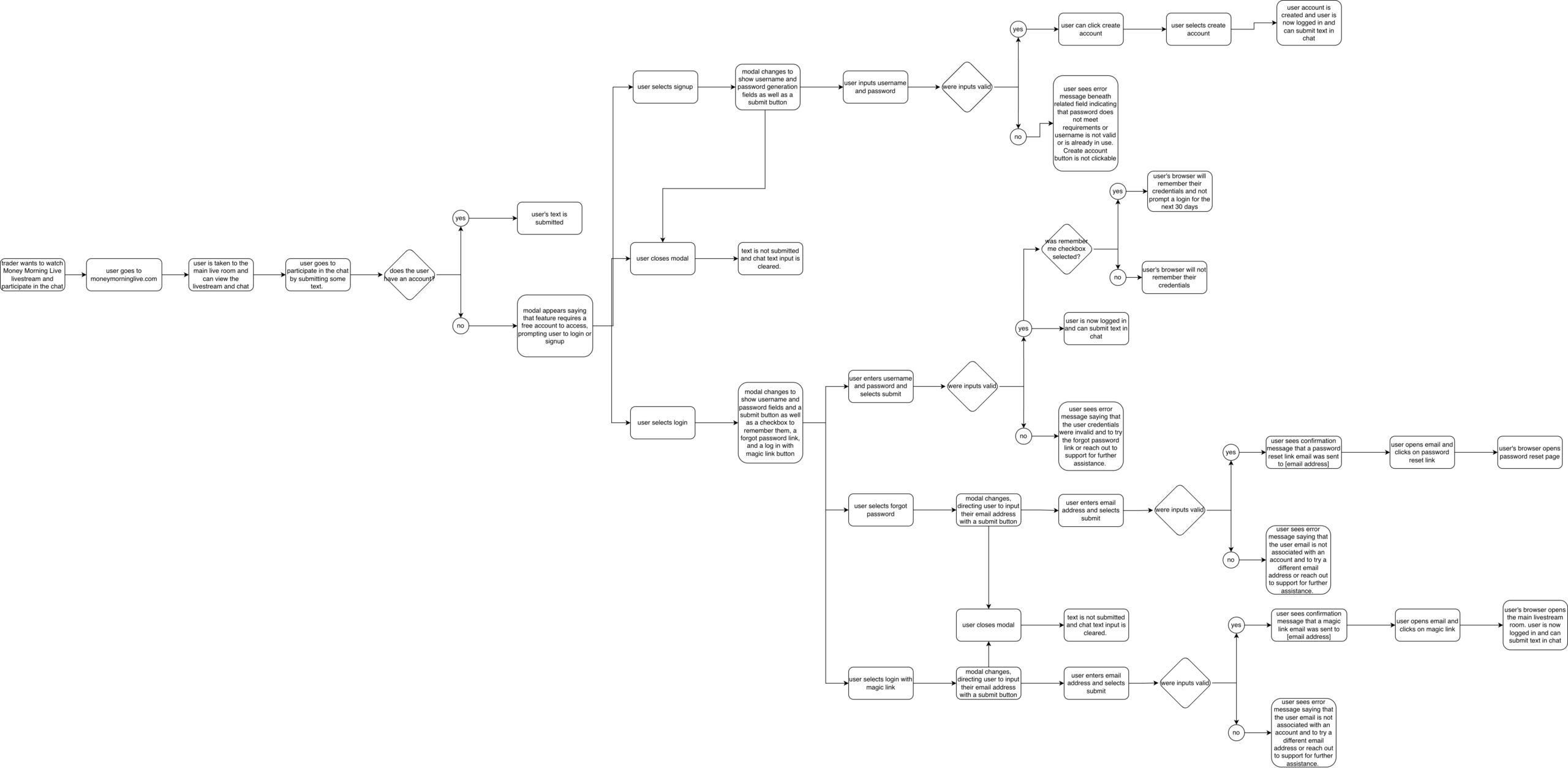
User flow for the gated chat feature — mapping every authentication path including signup, login, magic link, and forgot password states.
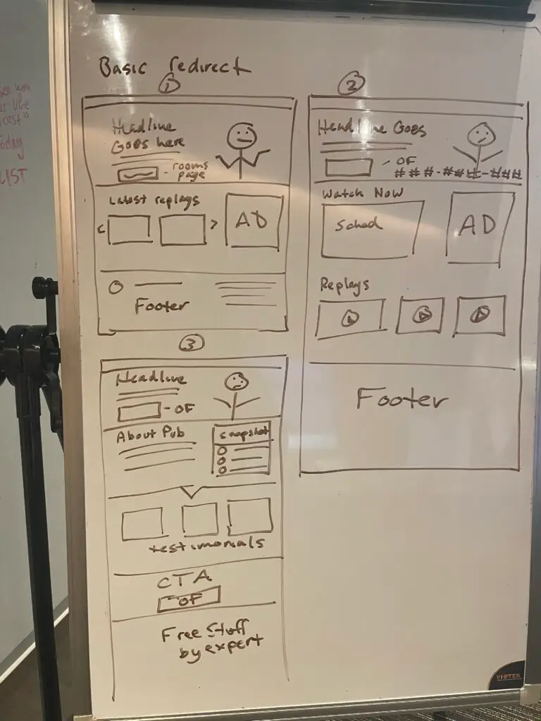
The Rooms page became a dynamic hub: live status indicators, schedules, and a clear distinction between subscribed and unsubscribed rooms — with unsubscribed rooms linking directly to targeted pitch pages with newsletter opt-ins.
When external development resources were reduced mid-project, I built the pitch pages myself in WordPress to keep momentum. I also ran evening calls with publishers after market close to configure individual trading rooms — recognizing that waiting for resources that weren’t coming would stall the whole project.
Outcomes
The redesign produced measurable improvements across every area it touched — including areas that previously had no conversion activity at all.
Lead generation was the standout result. The new email capture mechanisms — gated chat, Follow buttons, and pitch-page modals — generated an estimated 80–150 new subscribers per month from a platform that had been capturing virtually none.
Engagement metrics reflected the navigation and content improvements: the redesigned Rooms page saw a ~35% increase in average session duration and a 22% lift in click-through rate to rooms and pitch pages. Average time on the main Livestream page increased by an estimated 28–40%, and pages-per-session across the live trading section rose approximately 18% — indicating users were moving more fluidly between shows and content.
These weren’t incremental improvements to an existing funnel. They were new conversion touchpoints built from scratch on a platform that had been leaving thousands of daily viewers uncaptured.
Takeaways
Working on Money Morning Live taught me things I couldn’t have learned in a cleaner engagement.
First, heuristic frameworks are stakeholder tools as much as design tools. Leading with Nielsen Norman’s established principles gave me a credible, evidence-based foundation for every recommendation — which made it significantly easier to get buy-in on changes that might otherwise have felt subjective.
Second, UX and business objectives aren’t in tension — they’re the same conversation. Every navigation improvement made the platform easier to use. Every conversion touchpoint made it more valuable to the business. The best design decisions served both at once.
Third, resourcefulness is a design skill. When development bandwidth disappeared, I didn’t wait — I built the pitch pages myself, ran the publisher calls myself, and kept the project moving. Adaptability isn’t a soft skill. It’s how things actually get done.
© 2025 Ariel Parzynski Design