
Improving User Experience for Malware Analysis at TeamWorx Security
client: TeamWorx Security, a cybersecurity SaaS company in Columbia, MD
role: Senior UX/UI Designer
Background
TeamWorx Security was looking for ways to improve its flagship product, Hive-IQ in order to boost engagement and content creation within. Hive-IQ is a platform designed for collaboration, incident management, and sharing of malware/file samples and threat intelligence among commercial and government organizations.
Discovery
The project began when leadership asked me to run a skunkworks session — brainstorming potential new product strategies for Hive-IQ. I delivered the strategic concepts they asked for, but with an honest caveat: everything I’d generated was built on assumptions, secondhand information, and business goals. If we were going to commit development resources to a direction, we needed to hear from actual users first.
Leadership agreed — and went further than I expected, inviting users to come to the office to speak with me directly. I conducted 15 structured interviews: 10 individual sessions, plus a 5-person group session I adapted to accommodate scheduling constraints.
Combined with my own observation of user behavior in the platform, the research surfaced clear patterns:
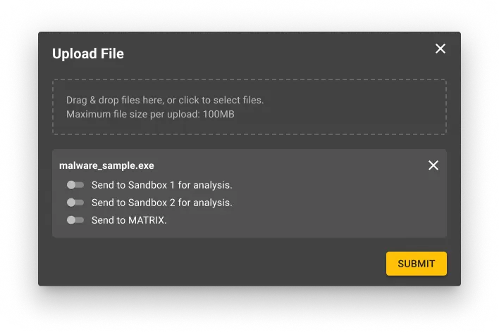
- Analysts frequently upload suspicious malware to utilize Hive-IQ’s automated sandbox features.
- The proprietary closed sandbox, MATRIX, within the Records section, is used for deeper manual analysis.
- Many functionalities of the Records section were underutilized — particularly by government employees due to disclosure restrictions.


Definition
The clear challenge was to streamline Hive-IQ for better usability by:
- Simplifying navigation within the platform
- Providing a more efficient method for users to submit files to both automated and manual sandboxes
Design
To address these needs, I proposed several design changes:
- Redesigned the file upload form to support simultaneous submission of multiple files to various sandboxes, reducing the previous repetitive steps where users had to upload each file individually.
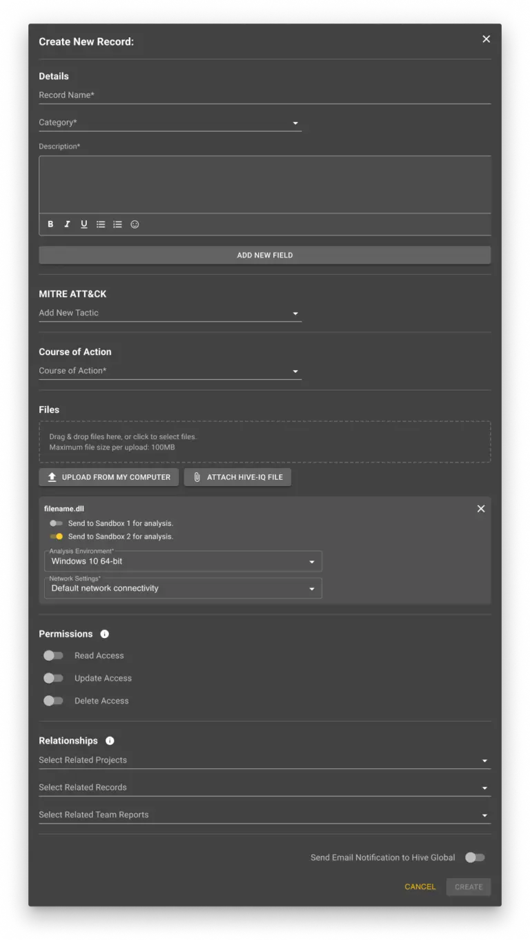
- Streamlined the record creation process by integrating file uploads directly, allowing for immediate analysis requests without navigating to separate tabs or remembering file names.
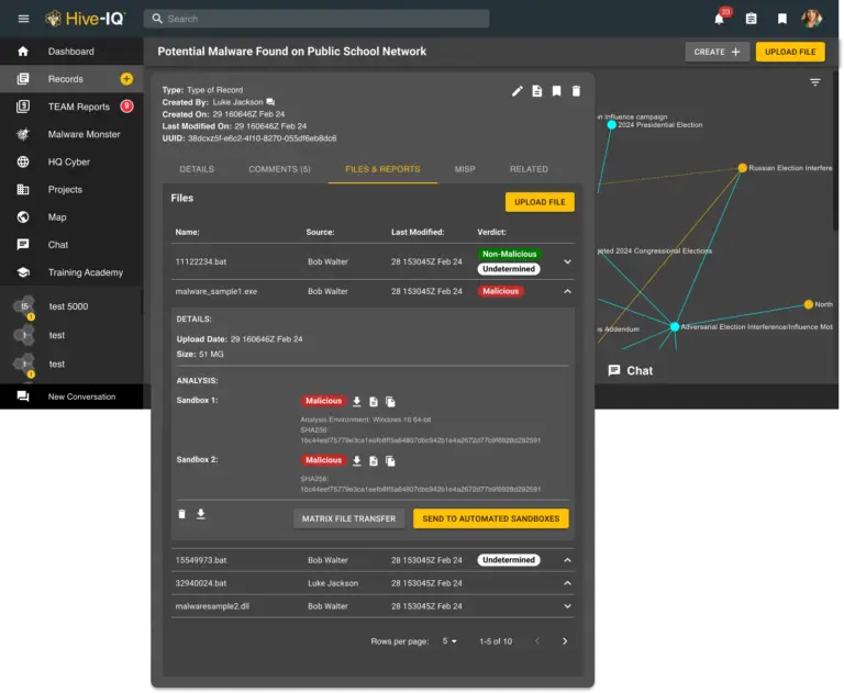
- Reorganized the content on the Records page through a card sort exercise with analysts to eliminate visual clutter, making it easier to locate and use key features.
- Integrated sandbox reports directly with their related files for easier access, eliminating the need to switch between different tabs or windows to view analysis results.
- Introduced a status indicator for MATRIX that also handled login in a new tab, simplifying the user’s workflow by automating the login process.

- Added quick-access shortcuts at the top of the homepage newsfeed for the most frequently performed actions.


Development
These design solutions were detailed in a series of JIRA tickets to guide the engineering team through implementation. The development process took approximately 10 months, with several iterations as engineering and QA identified new complexities in the file upload and analysis process.
Outcomes
The redesign yielded significant improvements:
- An 86% reduction in steps for file analysis using automated sandboxes, and a 33% reduction for the manual sandbox, MATRIX.
- Improved the success rate of logged in users accessing the MATRIX sandbox by roughly 50%.
- Enhanced user experience by reducing visual clutter on the records page and record creation form, leading to a 20% increase in record creation.

Takeaways
This project taught me three things that have shaped how I work since.
First, advocating for research is part of the job. The skunkworks session could have ended as a deck of untested assumptions — instead, making the case for user validation changed the direction of the entire project. Influencing how decisions get made is as important as the designs themselves.
Second, high-impact beats high-volume. As the sole UX designer, I couldn’t fix everything — so I learned to prioritize the changes that would deliver the most significant benefit to the most users, like the 86% reduction in file analysis steps.
Third, collaboration with engineering and QA isn’t a handoff — it’s a partnership. Ten months of iterations meant continually adapting designs as new technical complexities emerged, and the final product was stronger for it.
© 2025 Ariel Parzynski Design