
Picky: Designing for the 5pm Panic
client: Personal Project — Concept & Prototype
role: Senior UX/UI Designer
timeline: May-July 2026
TLDR: Watch this video!
The Problem
One of the things they don’t tell you about having babies is that they grow up to be very loud, opinionated toddlers. Multiply that by three and you have my current situation.
My husband and I both work full time. After a full day we get home, scramble to figure out what’s for dinner, and brace ourselves for the inevitable “I DON’T LIKEEEEE THISSS.” Yes, it’s developmentally normal. Is it stressful? Heck yeah it is.
And we’re not alone.
For Amy, a sales manager in Frederick, Maryland, this moment is physiological — two years of bloodwork show her cortisol spiking between 3 and 5pm right when she realizes she has no plan. For April in San Antonio, it’s the impossible math: a diabetic husband, a daughter with a sensitive stomach, and a mother who won’t eat poultry — all at the same table, all at the same time. For Rachel, a stay-at-home mom in remote upstate New York, it’s navigating ingredient availability, store sales, and kosher dietary restrictions all at once.
These aren’t edge cases. They’re Tuesday.
The Opportunity
The meal planning app market is projected to reach $5B+ by 2034, growing at 10–12.5% annually — faster for AI-driven segments. But the most downloaded apps today are built for individuals, not families. They plan meals. They collect recipes. None of them know your family.
I audited three leading competitors to understand the gap:
Mealime ($2.99/month) is clean and fast but individual-focused with no AI, no family profiles, and trapped flows with no back button. Its grocery integration is a façade — it opens a website inside the app and requires manual login every time.
Ollie ($20/month) is the most sophisticated of the three: conversational onboarding, AI recipe generation, fridge photo scanning, real grocery sync, and family profiles that track likes and dislikes per member. But at $20/month it’s priced out of most families — and it stops at preference tracking. It doesn’t offer developmental context for picky eating or help parents strategically introduce new foods. That’s the direction I’d eventually like to take Picky.
Paprika ($4.99 one-time) is a 2015 app in 2026. Manual everything, zero emotional design, no AI, no family profiles. It even lets users browse unrelated websites in its in-app browser — a UX mistake that says everything about its lack of focus.
The gap is clear: every competitor is built for one person who cooks.
“Mealime and Ollie plan meals. Paprika collects recipes. Picky feeds families.”
Research
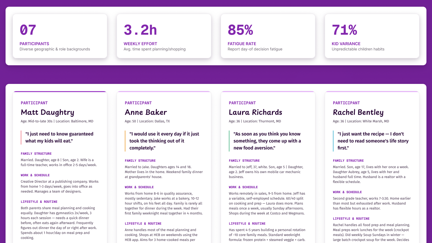
I conducted seven in-depth interviews with parents across Maryland, Texas, and New York over three weeks, recruiting for diversity across gender, family size, work situation, child ages, and dietary complexity. Every interview was recorded via Fathom and synthesized for patterns.
What I heard
Picky eaters and unpredictable food aversions — every single interview.
As soon as you think you know something, they come up with a new food aversion.
Laura, Thurmont, MD
Day-of decision fatigue — every single interview.
My cortisol spikes every day at 3pm when I realize I have no idea what's for dinner.
Laura, Thurmont, MD
The same meal rut — six of seven interviews. Parents described building a rotation of five to ten “safe” meals over years and getting completely stuck in it.
Healthy vs. tasty tension — five of seven interviews. Parents wanted nutritious meals. Their families wanted delicious meals.
Overlapping dietary restrictions. April’s household alone had a diabetic husband, a daughter with a sensitive stomach, and a mother who won’t eat poultry. Everyone still wanted flavorful food.
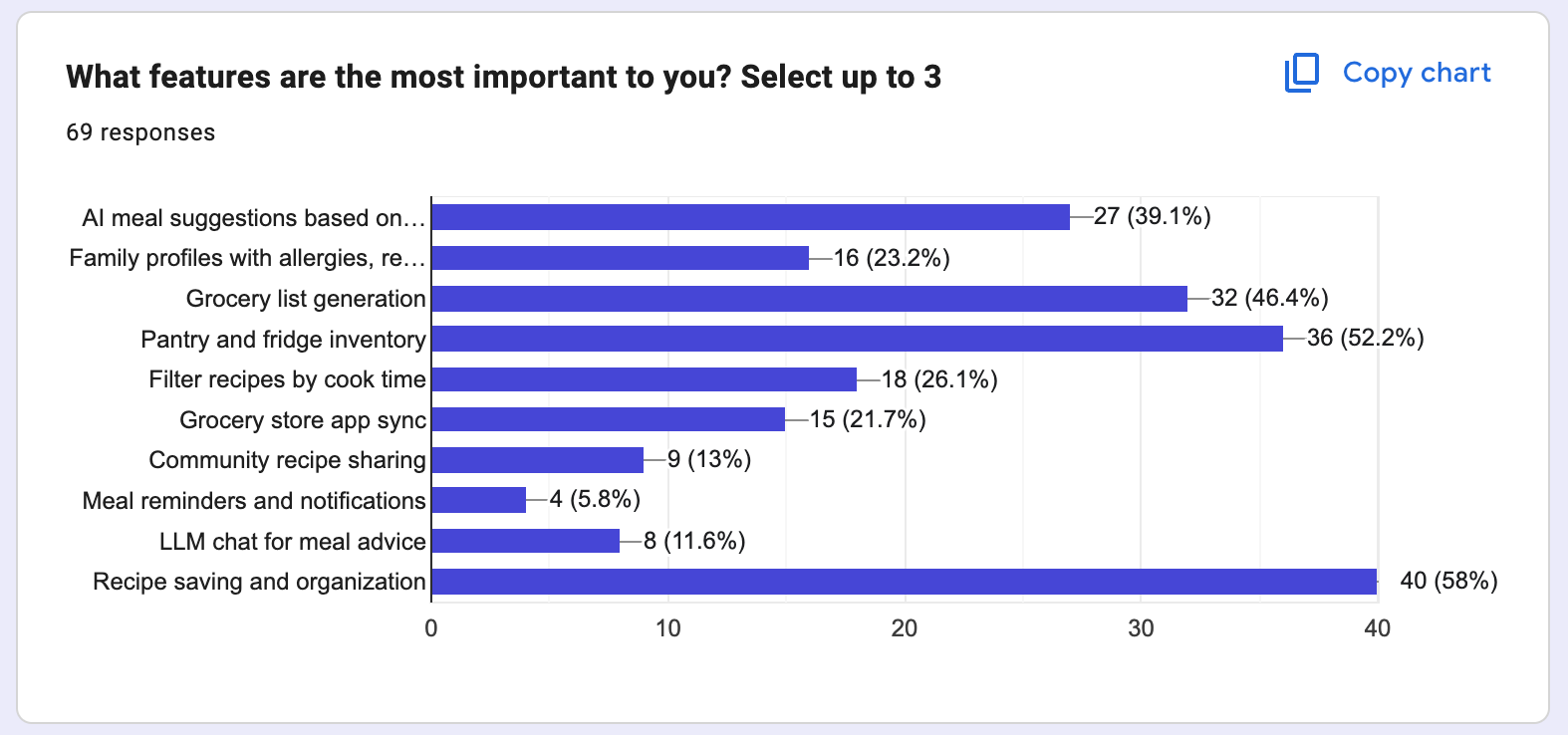
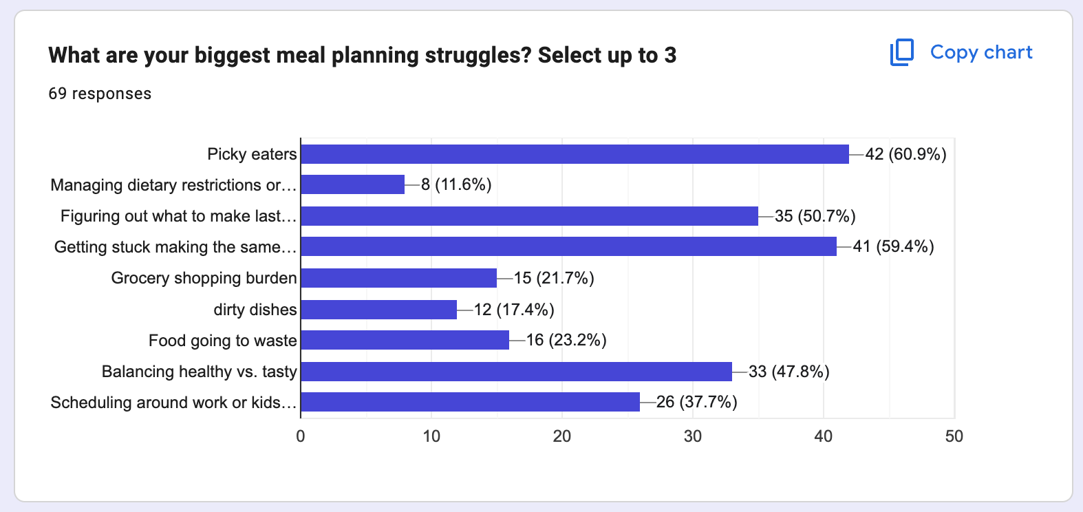
I validated these with a survey to 69 parents through Facebook parenting groups and LinkedIn. Top pain points: getting stuck making the same meals (61%), picky eaters (58%), figuring out what to make last minute (52%), balancing healthy vs. tasty (47%).
A standout finding: 36% already use ChatGPT for meal planning. Parents want AI assistance — they just don’t have a tool built for their family’s needs.
Define
Problem Statement
“Busy parents need a way to confidently feed their family every day because the constant mental load of navigating picky eaters, dietary restrictions, and lack of inspiration makes dinnertime feel overwhelming rather than enjoyable.”
Design Principles
- Take it off my plate — every interaction should reduce mental load, not add to it
- Know my people — my family isn’t generic, and neither are their needs
- Meet me in the chaos — designed for real life, not ideal conditions
- Don’t make me fill out a form — earn trust through value, not data collection
- Show me we’re making progress — help parents see their family growing, one meal at a time
Personas
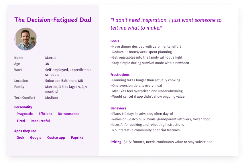
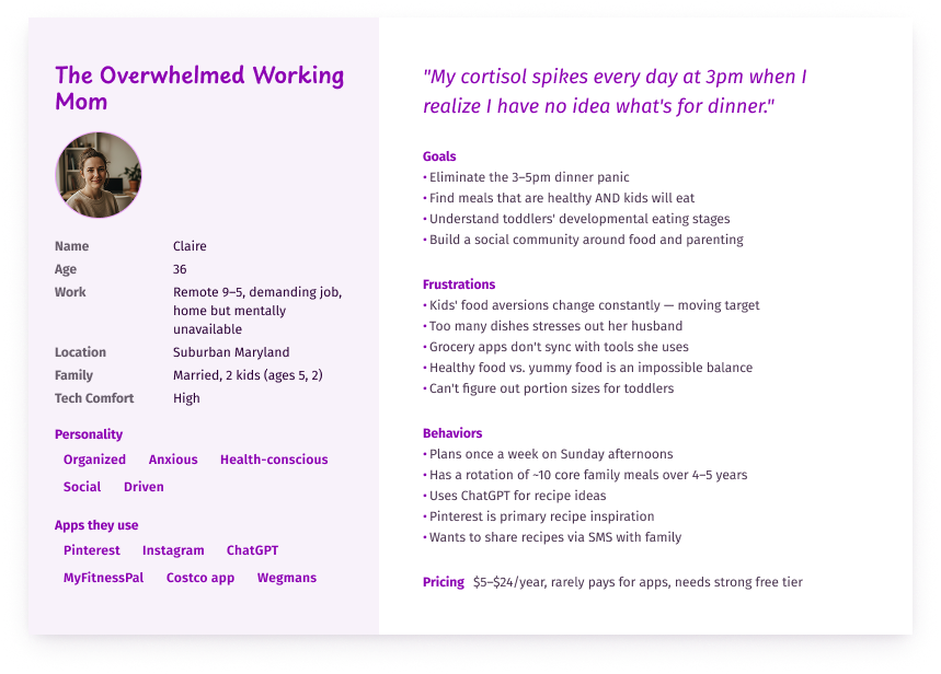
Marcus (decision-fatigued dad who just wants someone to tell him what to make), Claire (overwhelmed working mom stuck in a rotation), Diana (exhausted primary planner managing a diabetic husband, food-sensitive daughter, and picky mother), and Nadia (health-conscious budget planner in rural upstate New York shopping around store sales).
Design
Meet Earl
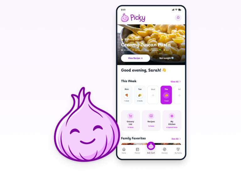
Earl is a friendly purple onion. He’s Picky’s mascot, guide, and emotional core — the face of every suggestion, nudge, and celebration in the app. He started as a hand-drawn pencil sketch, was refined using Adobe Firefly, and became the foundation of the entire brand.
Earl isn’t decoration. He’s a design decision. Mealime’s design is calming, and Ollie’s copy is friendly. But calm and friendly aren’t the same as support. Earl is the most emotionally available presence in the category: a character who knows your family, remembers what Milo hates, celebrates the wins, and doesn’t take it personally when you say “not tonight.” Using Picky feels like having someone in your corner at 5pm.


The Onboarding
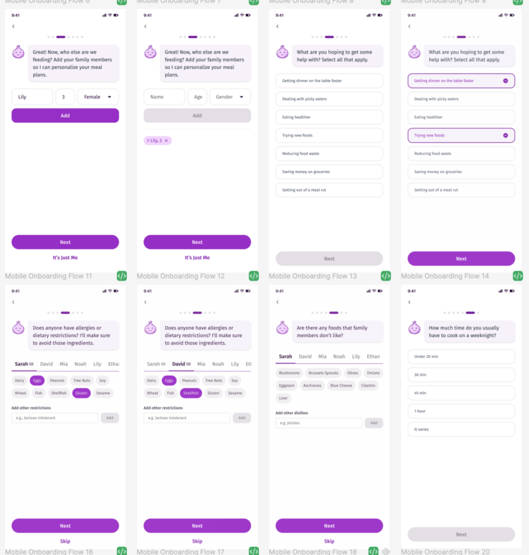
The onboarding was the most important design challenge — it had to collect enough information to make Picky genuinely useful without feeling like a chore. The ideal was a fully conversational AI setup, but for an MVP that was too expensive to build and run. So I designed the middle path: structured steps framed as a guided conversation with Earl, using chips and simple selections to keep input fast and forms to a minimum. Earl asks, you answer, and it moves.
Then the payoff lands where it matters most — instead of an empty home screen, users see Earl with a celebratory message: “I went ahead and planned some meals based on what you told me. Swap anything that doesn’t feel right — I won’t take it personally. 🧅” This eliminates the cold start problem entirely.
The Core Flows
The home screen answers one question the moment you open it: what’s for dinner tonight? A full-bleed food photo shows Tonight’s Pick with meal name, cook time, serves, and a family tag — plus two CTAs: “View Recipe →” and “Not tonight 🔄.” Earl lives in the center of the bottom nav, signaling he’s the heart of the experience.
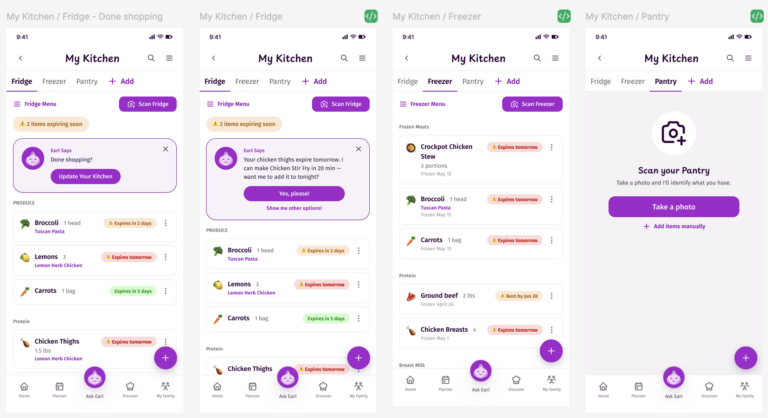
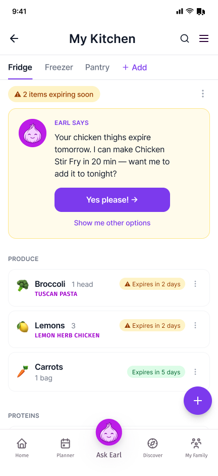
My Kitchen is where Picky’s pantry intelligence lives. Fridge, Freezer, and Pantry tabs with expiry color coding, and Earl’s most differentiated moment: a specific, actionable suggestion card. “Your chicken thighs expire tomorrow. I can make Chicken Stir Fry in 20 min — want me to add it to tonight?” Not a warning. A solution.
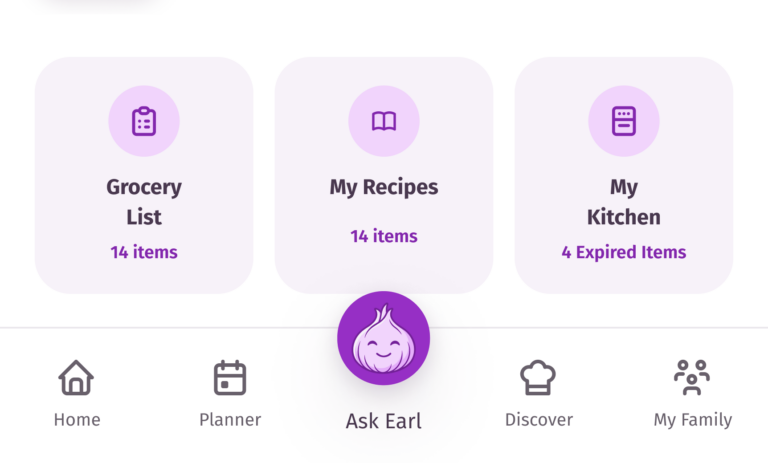
Why My Kitchen and the grocery list aren't in the bottom nav
Survey results ranked pantry inventory (50%) and grocery list generation (48%) in the top five features parents wanted, so an obvious move would have been to give them dedicated slots in the bottom navigation. I made a different call.
My Kitchen was a “love it or hate it” feature in interviews. My decision-fatigued dad persona was unlikely to keep it up to date — or use it at all — while other personas would use it daily. Giving it top-level nav prominence would have prioritized a feature that a significant slice of users might not touch, at the cost of screen real estate that matters for everyone. Access from the home screen was the right level of surfacing.
The grocery list is different: it’s genuinely valuable, but only when a user is actively planning to shop. It’s a task-driven feature, not a return-to-daily one. Elevating it to the persistent nav would overweight something users open once a week at most.
Both features are one tap from the home screen. Neither belongs in the nav parents see every time they open the app.
MVP Scope
Not everything I heard in research could be built at once. I defined a focused MVP based on what the research validated, what no competitor offers, and what’s realistic to ship.
The MVP includes: Earl-guided onboarding, per-person family profiles with allergies and dislikes, AI meal suggestions that auto-populate the week, meal swap suggestions, recipe saving, pantry and fridge inventory with photo scanning, and grocery list generation organized by store.
Deliberately excluded: in-app browser for unrelated browsing (Paprika’s mistake), locked flows with no back button (Mealime’s mistake), individual-only focus (every competitor’s mistake), and excessive manual input.
AI Workflow
| Phase | Tool | How it was used |
|---|---|---|
| Research | Fathom | Recorded & transcribed user interviews |
| Synthesis | Claude | Identified patterns across sessions, refined research questions |
| Ideation | Moonchild + Figma Make | Rapid wireframe generation → hi-fi |
| Brand Identity | Adobe Firefly | Earl’s visual design and brand system |
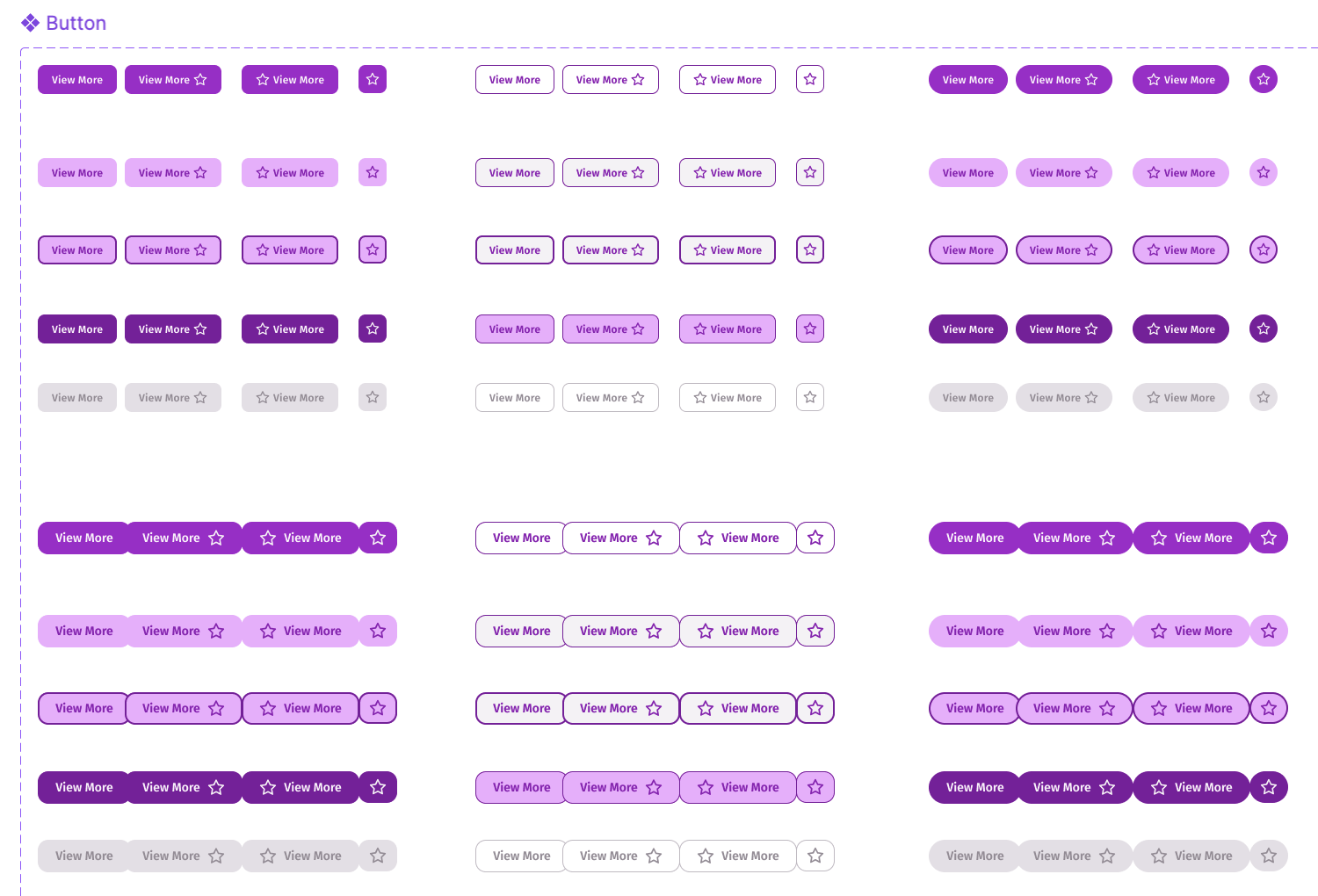
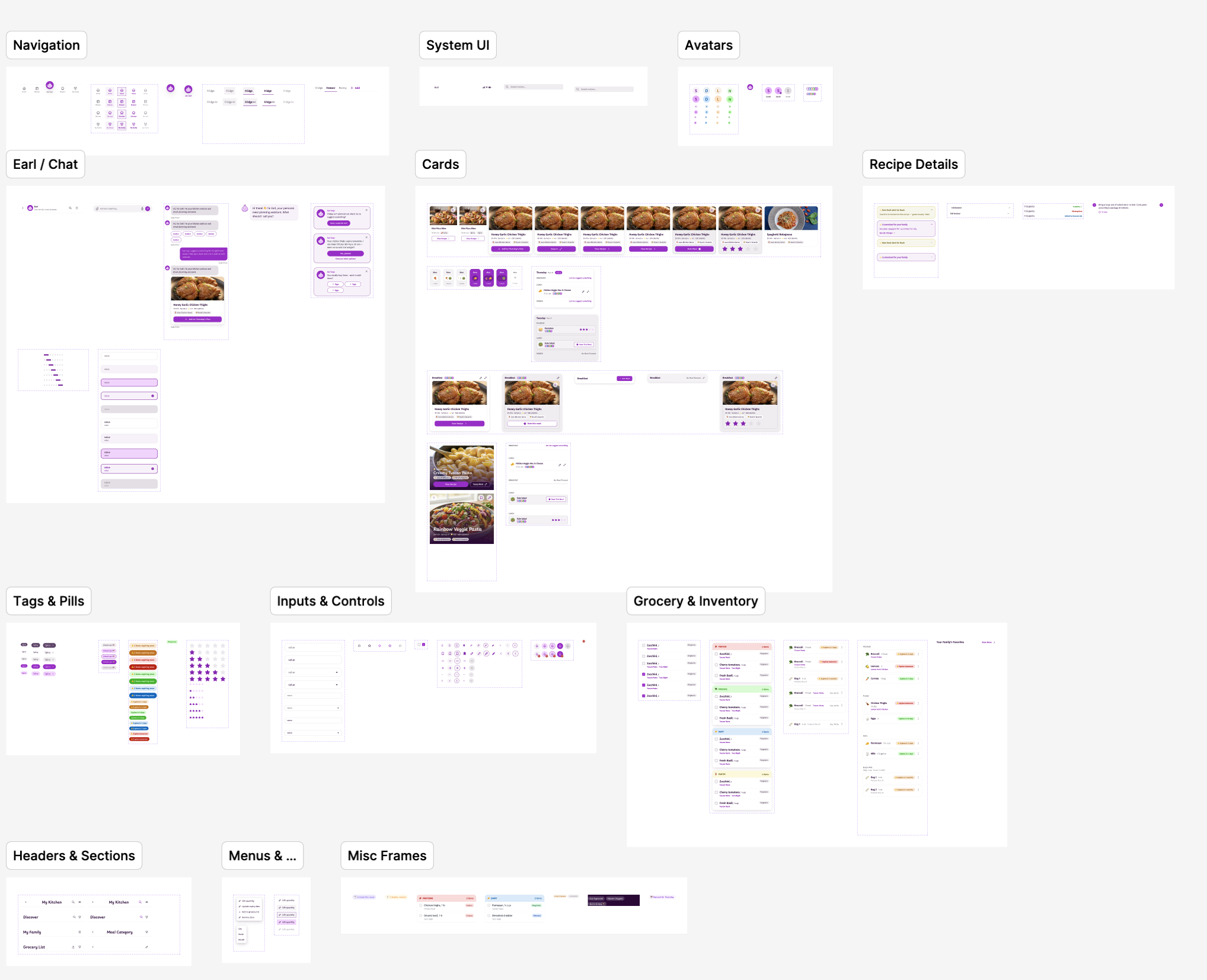
| Design System | Figma | Variables and components built manually |
| Prototype | Claude Code + Figma MCP | Design-to-code workflow |
| Usability Testing | Fathom + Claude | Recorded sessions, cross-session synthesis |
To build my initial screens I spent a lot of time prompting Moonchild and Figma Make — one screen or flow at a time. Both got me to something close to hi-fi wireframes fast. I learned how to get the most out of each tool and how far usage tokens could take me before I needed to start fresh.
At the same time I was building out my design system in Figma — manually creating variables and components. (Figma’s agent feature became available right after I’d completed this step, so I wasn’t able to use it there. Once I did have access to it, it was excellent for generating recipe detail content.) After the wireframes were in good shape I linked everything together in Figma’s prototype mode and moved into testing.
Testing and Iteration
I ran six moderated usability tests on the hi-fi Figma prototype in June 2026, plus one in-person session on a phone — the device Picky is actually designed for. Participants were parents spanning my personas, recruited from my survey pool and personal network. Sessions covered core flows: onboarding, finding tonight’s dinner, swapping meals, acting on expiry alerts, rating meals, and building grocery lists. Findings and the design changes they drove:
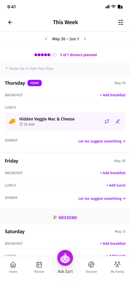
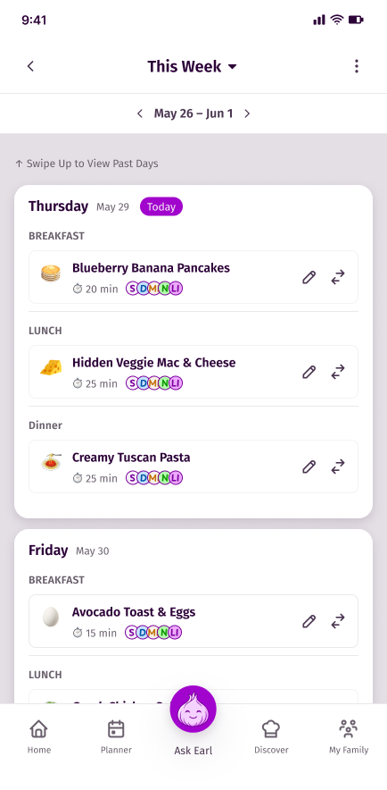
Finding 1 — Empty planner feels like work. Three participants expected a full week of meals waiting after onboarding. Empty slots shifted the work back to them. The empty state wasn’t a deliberate choice — it was just where the page landed. What testing surfaced was the emotional weight of that decision: a full planner made parents feel supported before they’d done anything, and an empty one quietly reversed that.
Redesign: Earl now populates significantly more of the week so the first thing a new user sees is a plan already underway.
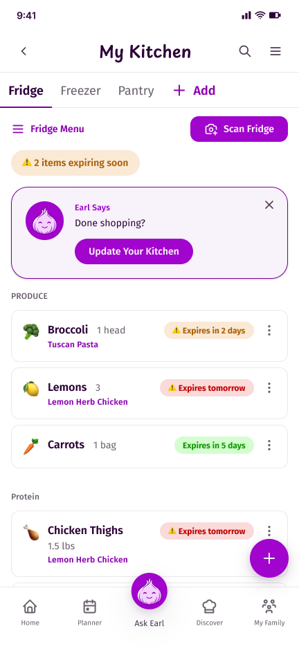
Finding 2 — My Kitchen only works if keeping it updated is effortless. Highest-delight feature across sessions — one participant said she’d use it daily for the inventory alone. But manual entry was a barrier, and testers doubted they’d keep it accurate. Pantry intelligence isn’t an inventory problem, it’s a maintenance problem.
Redesign: Photo scan promoted from secondary to primary input. Added a “Done shopping? Update your fridge” modal after grocery list completion, plus inline “I have this / I don’t have this” quick-edits on recipe screens so inventory updates as a side effect of normal use.
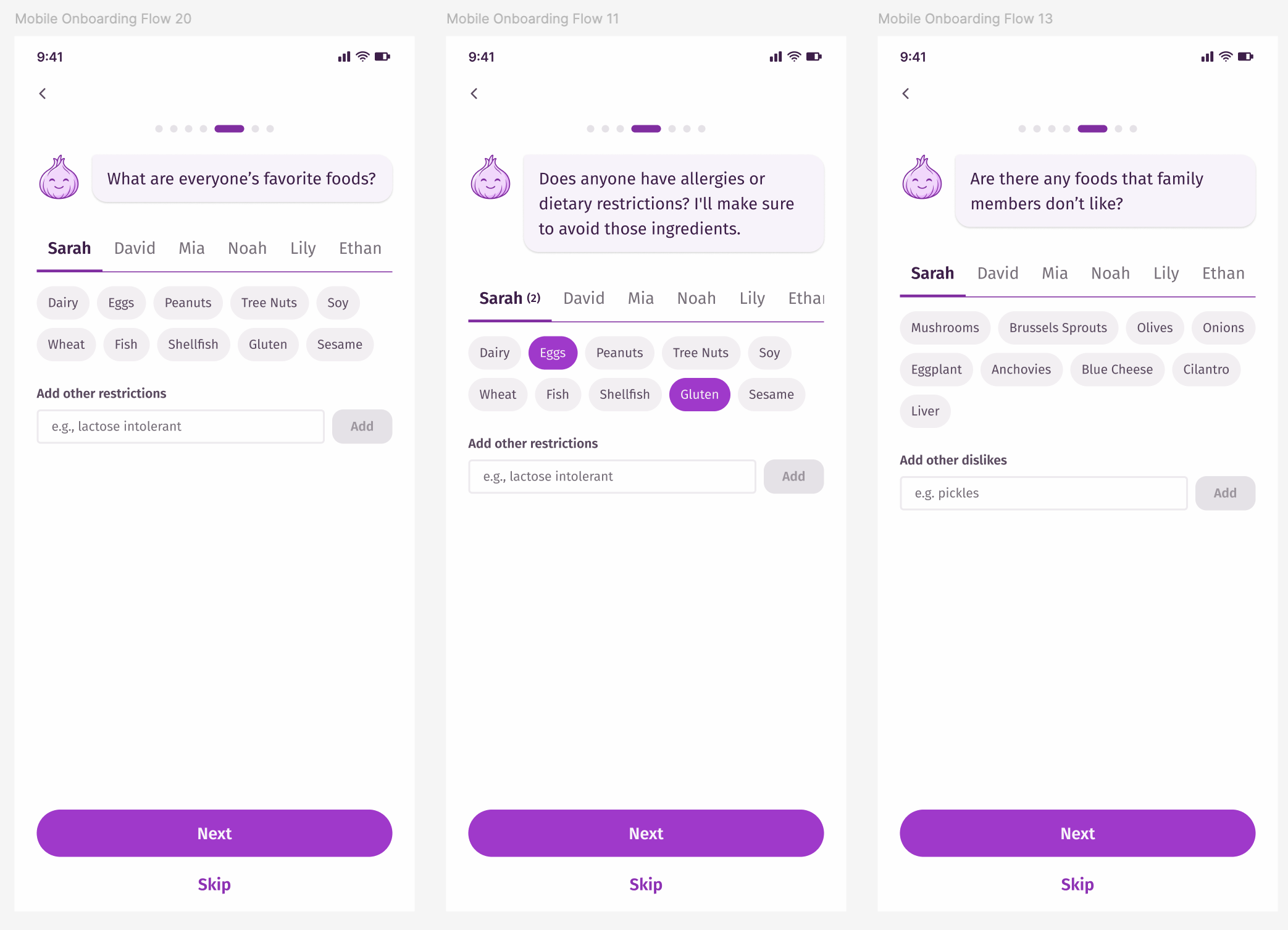
Finding 3 — Onboarding asked the same question twice. The “foods your family avoids” screen felt redundant after allergies and dietary restrictions — testers couldn’t see a meaningful difference between them. The language wasn’t doing enough work to explain the distinction.
Redesign: Renamed “foods your family avoids” to “foods family members dislike” to make the distinction from allergies and dietary restrictions clearer. Added a separate step for foods and cuisines the family actually enjoys — something testers requested and that gives Earl more to work with when making suggestions, not just more to exclude. The tradeoff: a true per-person allergy-vs-dislike distinction isn’t yet surfaced during onboarding — where it belongs is on each person’s individual edit screen under My Family.
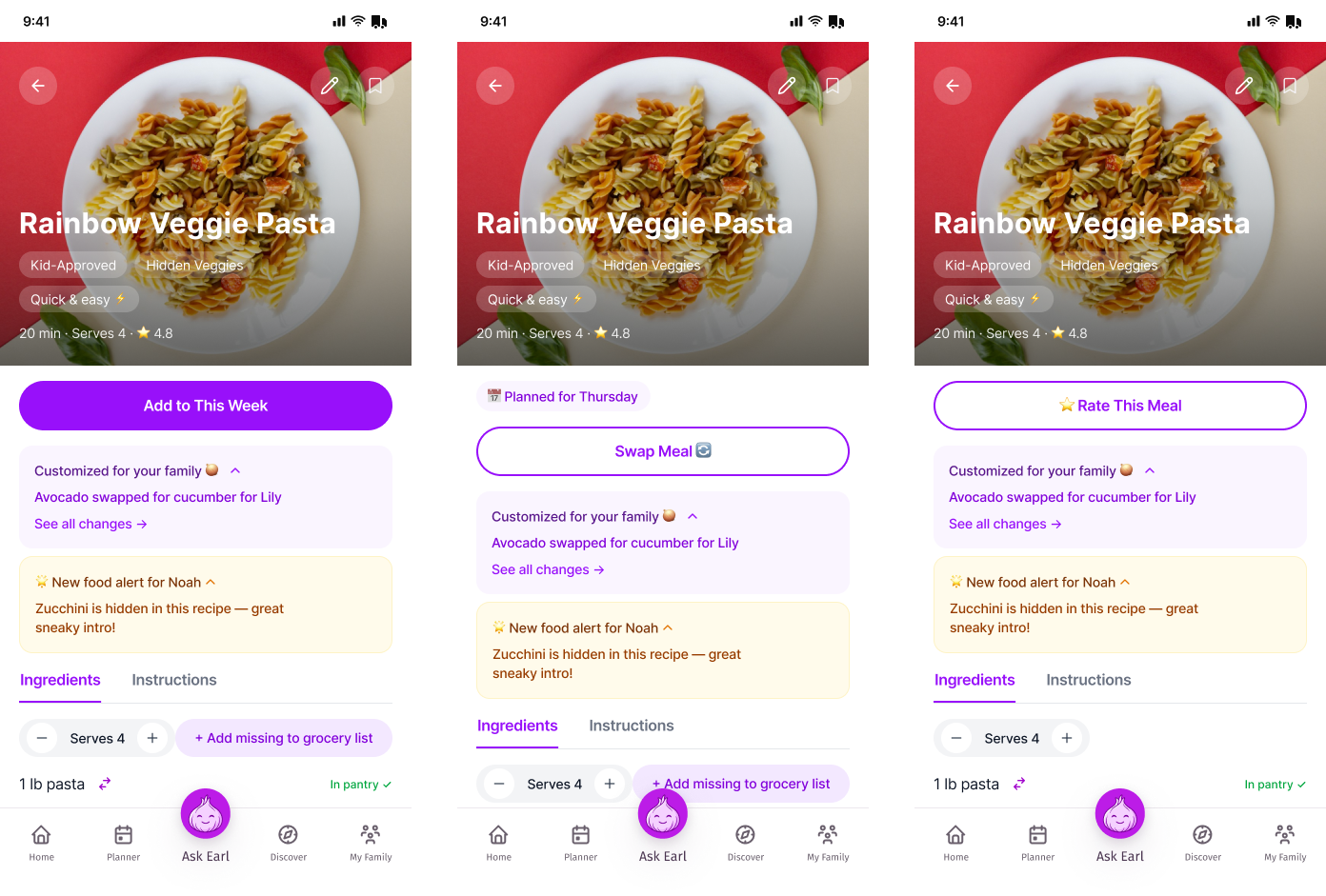
Finding 4 — The recipe screen states needed sharper context awareness. I’d already designed distinct states for rating a completed meal, swapping in a new one, and adding a recipe to the planner.
Testing surfaced that each state was still showing information that didn’t belong — and missing information that did. On the add-to-week state, one tester wanted a short recipe description before committing to view the full page. On the rate state, multiple testers wanted to see who had actually eaten the meal. And the “add missing to grocery list” action was still present on a completed meal that doesn’t need one.
Redesign: Added a short description on the add-to-week state so users can decide without navigating away. Added a “who was present” element to the rate state so Earl can tailor future suggestions to actual diners. Removed the “add to grocery list” action from completed meals — the ingredient list stays for reference, but the action itself is no longer relevant.
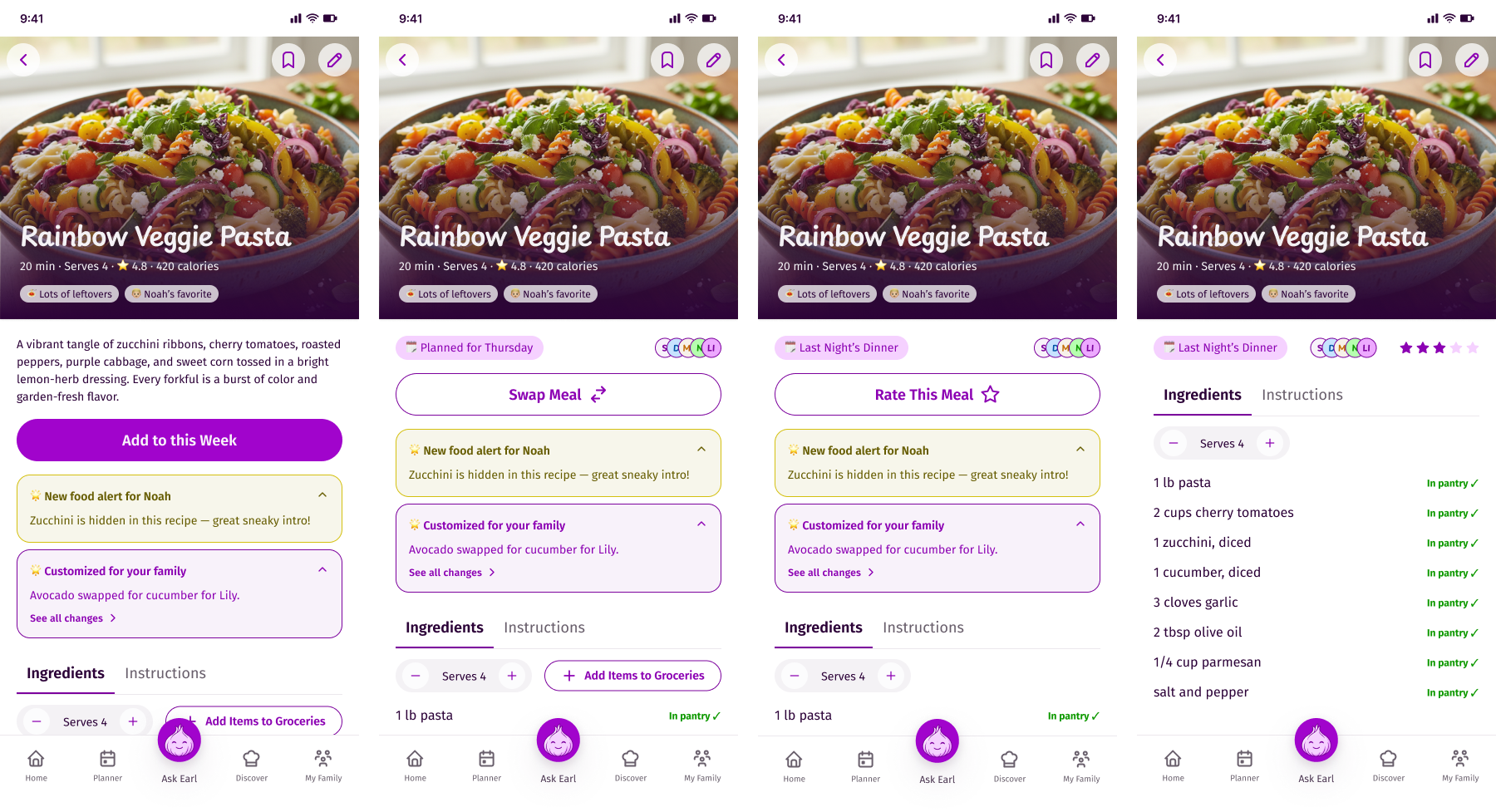
Other structural fixes carried into the redesign: the weekly planner past-day hierarchy got clearer visual separation; “Swap” language became more consistent throughout the app as a single concept; the grocery list added a purchased vs. still missing accordion since the checkbox was reading as disabled; post-meal rating flow now asks “Who was present tonight?” before “Who liked it?”; anonymized profiles (nicknames and age ranges) became an option since privacy concerns were a mixed signal across sessions; and Earl’s suggestions now include seasonal meals and special occasions, with options to refine preferences living in individual edit screens rather than onboarding.
The best signal came unprompted. Asked to describe Picky, one participant didn’t say “meal planning app.” She said:
A personal kitchen advisor.
More accurate and more differentiated than anything I’d written myself.
AI Workflow in Practice: Building the Prototype
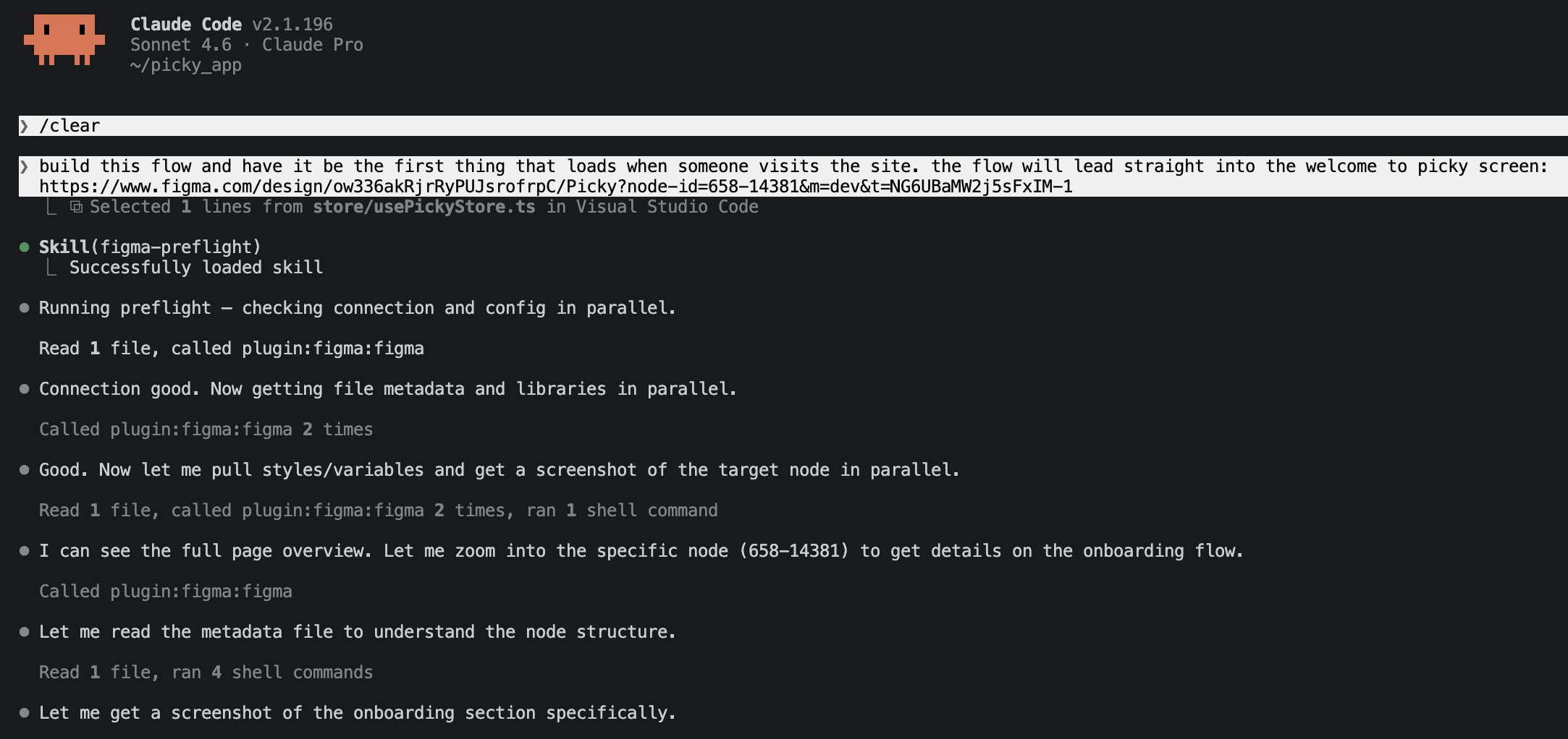
The prototype was built with Claude Code + Figma MCP, with me managing the process as the designer. It wasn’t hands-off code generation — it was active iteration, closer to expedited dev ticket identification.
Design system adherence was the biggest struggle. Claude Code repeatedly hardcoded values instead of using design tokens, and pulled component states from placed Figma instances instead of the main component set, silently dropping hover/focus/disabled treatments. The fix was structural: three skills — picky-component-inventory, picky-figma-to-react, and picky-figma-design-system — that made the design system non-negotiable. Before any build, the inventory skill registers every component and state up front; the other two enforce one-to-one Figma-to-React mapping and token-only values. Built earlier, they would have saved several iterations.
What worked: Diff-first prompting — asking Claude Code to report before fixing — was the most reliable correction pattern, catching invented components before they got committed. Surgical one-file prompts beat broad rebuilds, and explicit node-id targeting became a standing rule. For tokens, I started fresh chats between screens and reserved the planning chat for architecture, not routine prompts. One trick: pasting code into Claude and asking which specific lines to change used a fraction of the tokens of a full rewrite. Quick feedback directly in the Claude Code terminal also worked well for small fixes.
The rhythm was: spot an issue → write a scoped prompt → implement → verify against Figma → move on — structurally identical to writing and closing a dev ticket, except the backlog collapsed into minutes instead of a sprint. Claude Code got the build about 80% there; structured iteration with real design system constraints closed the rest.
Prototype
Live prototype: https://picky-app-three.vercel.app/
Built with React/Next.js 15, Tailwind v4, and Zustand for state management. The demo family is the Martins — fully hardcoded with no backend. Earl chat is wired to live Claude Haiku through a server-side route, the only live API feature.
Loom walkthrough coming soon.
Takeaways
I started this project with no real idea of what vibe coding would be like. Picky was my way of building AI fluency on my own terms: use as many AI tools as possible, but as tools. Not a replacement for the designer.
The lesson I couldn’t have gotten from reading about AI design tools is that each one has a sharp edge and a blunt one. Firefly was impressive at generating Earl’s visual identity but couldn’t follow nuance — asking for subtle emotional variants got me heavy-handed reinterpretations. Figma Make, Moonchild, and Claude Code generated wireframes fast but ignored a design system unless I forced adherence through skills and explicit prompts. These tools are better designers without a design system to follow — which also makes them more generic. Claude was the standout for strategy: research synthesis, next-step identification, walking me through unfamiliar territory like GitHub, MCPs, and Vercel. And the post-testing redesign was the clearest reminder I was still the designer — AI couldn’t take my 1.0 and reason its way to 2.0. That synthesis was mine.
I had basic prior experience with Git, React file structure, HTML/CSS, and JavaScript — enough to hold my own with engineers, but never enough to build something at this level myself. This project is the first time AI lowered that barrier far enough for me to actually cross it. Dylan Field said at Config 2026 that code is now a material for designers to use. That’s what these three months proved to me. AI didn’t replace the work I love — talking to real people, understanding their problem, designing the solution. But it did something I didn’t expect: it empowered both versions of me. The stressed, overwhelmed working mom who just needs dinner figured out. And the designer who always wanted to build.
© 2025 Ariel Parzynski Design